TL;DR:
- Bad websites are a turn-off for customers and can harm your business.
- Signs of a bad website include outdated design, poor user experience, and technical issues.
- Tools like Hotjar and Google Analytics can help you understand your website users better.
- Updating your outdated website can lead to cost efficiency, improved security, mobile friendliness, scalability, and enhanced brand perception.
- Consider using resources like Cut+Dry to make your website stand out in the Foodservice industry.
Bad websites suck. They load inch by inch. They have buttons that take you nowhere. And once it actually loads, there’s either too much information or not enough information. It's so last century! If you’re just a customer, you could just close the browser, forget about your bad experience and move on. But if this is your website as a foodservice distributor, then you’re in serious trouble.
Restaurant operators generally turn to online resources to identify new suppliers, in addition to methods like word-of-mouth. If your website is not optimized to show up when restaurant operators in your geographic location are searching for someone who sells the items you carry, then that's potential revenue down the drain.
Do you think your website design is bad? Here are some signs to look out for:
- Visual design
- Outdated design trends: If your website looks like it belongs to the early 2000s with design elements like flash animations, excessive gradients, or bevel and emboss effects, it’s likely outdated.
- Non-responsive design: Modern websites need to be mobile-friendly. If your site doesn’t adjust to different screen sizes and devices, it’s a clear sign of an outdated design.
- Cluttered layout: Overly busy layouts with lots of text, multiple fonts, and no clear visual hierarchy can make your site look outdated.
- User Experience (UX)
- Slow loading times: Websites should load within a few seconds. Slow load times can drive visitors away and indicate that your site needs optimization.
- Difficult navigation: If users find it hard to navigate through your website or can’t easily find the information they need, it’s a sign your UX design is outdated.
- Lack of social proof: Modern websites often include social proof like customer reviews, testimonials, and case studies. If your site doesn’t have any of these, it's outdated.
- High bounce rates: If visitors leave your site quickly, it could be a sign that your site isn’t engaging or doesn’t meet their needs. And, if you’re not able to track this in the first place, then it’s time for a rehaul.
- Technical aspects
- Non-secure: Websites should use HTTPS for security. If your site is still using HTTP, it’s outdated and may not be trusted by users or search engines.
- Non-optimized for search engines (SEO): If your website doesn’t follow current SEO best practices, it won’t perform well in search engine rankings.
- Lack of integration with modern tools: Modern websites often integrate with various tools and platforms, such as social media, CRM systems, and marketing automation tools. Lack of these integrations means your website is outdated.
- Functional elements
- No interactive elements: Modern websites often feature interactive elements like live chat, interactive forms, or user-generated content. If your site lacks these features, it can feel static and is outdated.
- Poor browser compatibility: If your website doesn’t work well across different browsers or has issues in newer versions of browsers, it’s a sign it needs updating.
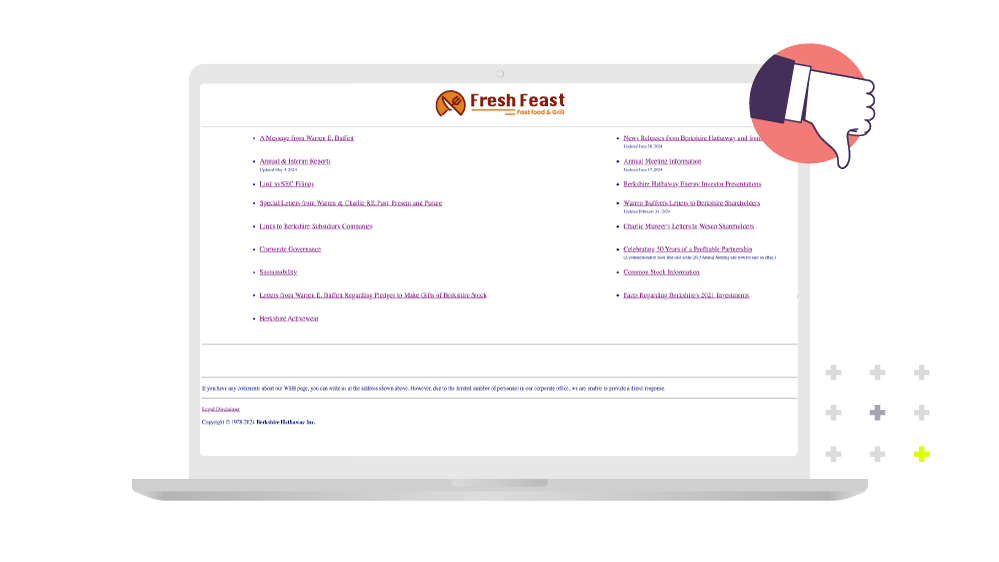
Here’s an example of a bad website design:

Tips to understanding your website user
Understanding what your average website visitor is like, what they are looking for and how they experience your website is key. There are some amazing tools like Hotjar and Google Analytics that let you analyze your website, understand the visitor and put those insights into good use.
Hotjar has tools like heatmaps, which show you where users click, move and scroll on your website - the redder it is, the more it is seen. This gives you a good idea of where you should place your most crucial information that you really want the visitor to see. Then there are tools that show you exactly how each user navigates the website - this allows you to spot issues on the fly and fix them.
With tools like Google Analytics you can check traffic sources (where your visitors are located, what search engines they use), bounce rates, average time spent and average pages per visit, among other metrics. This gives you a good idea of what you would like to change up in your website to improve engagement with visitors.
Here are the top 5 reasons why you should consider updating your outdated website:
- Cost efficiency in the long run: Yes, the initial cost may seem daunting (although if you’re a Cut+Dry partner, it's free!), but reduced maintenance costs, improved operational efficiency, and increased ROI through better website performance and conversions justify the initial expenditure.
- Improved security: Older websites have vulnerabilities that could expose both the business and its users to security risks. Data breaches are estimated to cost businesses $7.5 million annually. Modern websites are built with the latest security protocols and regularly updated, providing better protection against cyber threats and ensuring data integrity. It gives you peace of mind and saves you money from potential cyber threats.
- Mobile friendliness: Let's be realistic, over 55% of website traffic comes from mobile devices, so if your website is not optimized for mobile that is a bad state. People want to be able to access your website on-the-go, when and where they want to so investing in a responsive design is key.
- The scalability to grow: Old technologies and website frameworks don’t offer easy scalability, but modern ones do. They provide the flexibility to add new features, integrate third-party services like e-commerce and digital payments and they adapt to changing business needs and tech advancements. Eventually you will have to modernize your website if you want your business to make use of all of these technologies.
- Brand perception and trust: If your website looks like it hasn't been updated since Y2K then customers are going to be suspicious. Poor user experience due to bad website design can also lead to a negative impact on brand perception and trust. A well-designed, modern website reflects positively on the brand's image and credibility. Users tend to trust businesses more if their online presence appears professional, up-to-date, and aligned with current design trends.
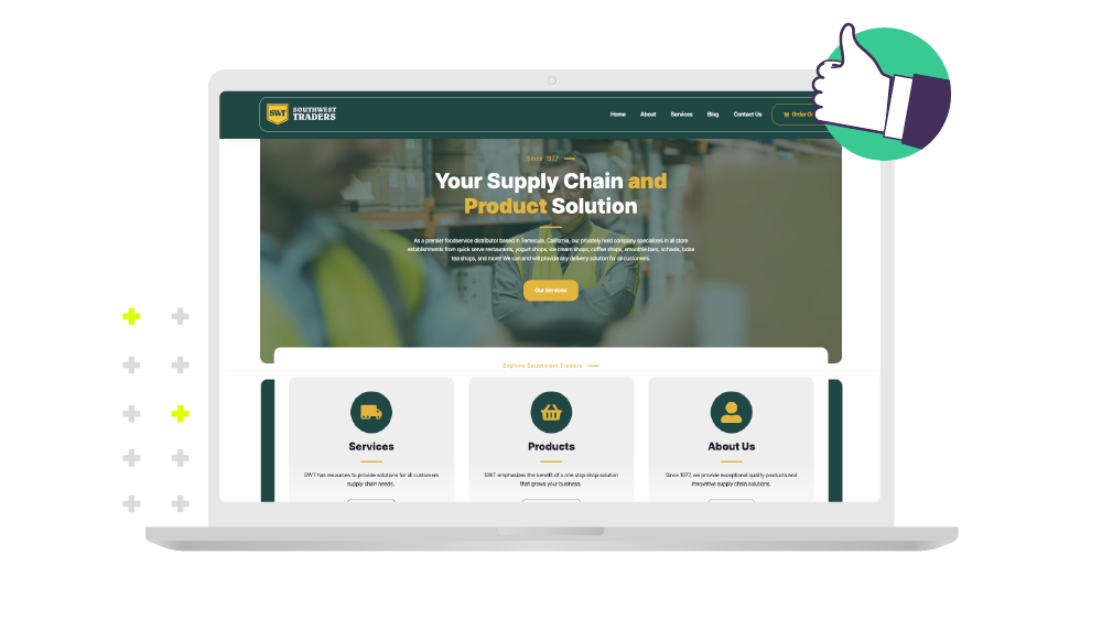
Here’s an example of a good website design:

Make your website pop!
Making your website pop is difficult, but not impossible. Not only is a brand-spanking new website going to give you an improved brand image but it's also going to be a key to unlocking the world of e-commerce for your restaurant operators.
With a badly designed website it's going to be hard to convince your customers to go digital with ordering. A modern, well-designed website is critical for e-commerce because it directly influences user experience, conversion rates, and overall business success. Firstly, user experience (UX) is paramount in e-commerce: a clean, intuitive design with easy navigation and fast load times enhances customer satisfaction and encourages repeat visits. Such websites also prioritize mobile responsiveness, catering to the growing number of users accessing online stores via smartphones and tablets.
Secondly, a visually appealing and functional design builds trust and credibility with potential customers. It conveys professionalism and reliability, essential factors in converting visitors into buyers. Moreover, modern e-commerce websites often integrate seamlessly with various payment gateways, customer relationship management (CRM) systems, and marketing tools, streamlining operations and improving efficiency. Ultimately, investing in a modern website not only attracts more traffic but also maximizes conversion opportunities, driving revenue growth in the competitive e-commerce landscape.
Investing in a modern website isn’t just about aesthetics—it’s a strategic move that directly impacts business performance. It attracts and retains customers, enhances operational efficiency, and reinforces your brand’s position as a reliable Foodservice distributor. By prioritizing website updates, you can stay ahead in the competitive e-commerce landscape.


